


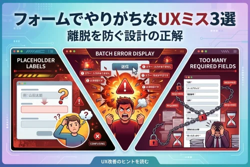
こんにちは!静岡県浜松市でWEBデザイナーをしています小瀧です。
Webデザインにおいて、「見出し」はページの印象を大きく左右する重要な要素です!
でも、ただフォントサイズを大きくするだけでは、情報の整理が甘く見えたり、退屈な印象を与えてしまうことも。
そこでおすすめしたいのが、CSSで背景付きの装飾を加えた見出しデザインです。
少しの工夫でグッとプロっぽく見えますし、ユーザーにとっても情報の区切りが一目で分かるようになります。
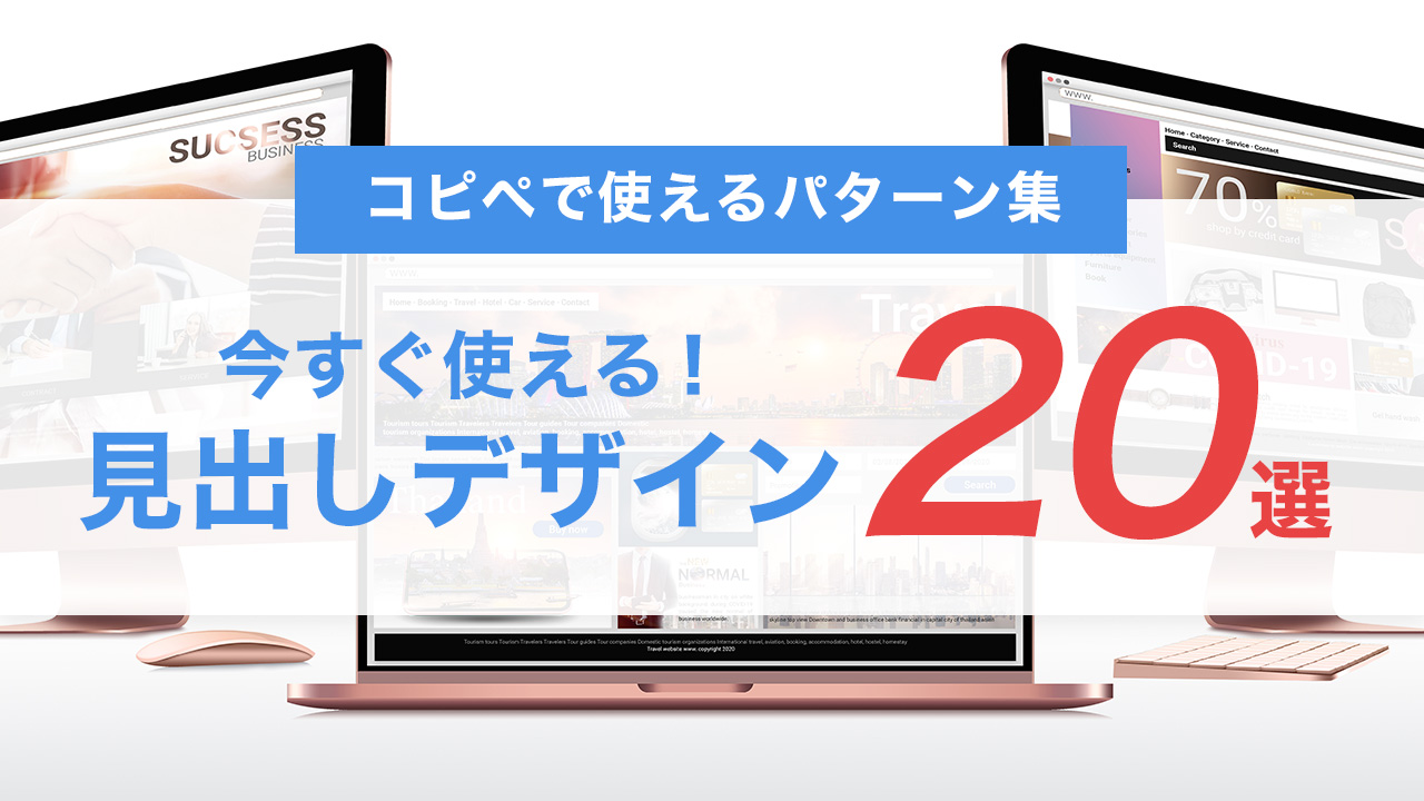
今回は、「すぐに使える20の背景装飾パターン」を実際のコードとともにご紹介します!
シンプルなデザインから目を引く装飾まで、用途に合わせて使い分けられますよ。
パターン01:左線+背景色のベーシックスタイル
See the Pen
Untitled by 小瀧賢 (@ekwwawpb-the-styleful)
on CodePen.
パターン02:下線風の背景グラデーション
See the Pen
Untitled by 小瀧賢 (@ekwwawpb-the-styleful)
on CodePen.
パターン03:角丸バッジ風
See the Pen
Untitled by 小瀧賢 (@ekwwawpb-the-styleful)
on CodePen.
パターン04:影付きボックス
See the Pen
Untitled by 小瀧賢 (@ekwwawpb-the-styleful)
on CodePen.
パターン05:背景画像付きタイトル
See the Pen
Untitled by 小瀧賢 (@ekwwawpb-the-styleful)
on CodePen.
パターン06:波形にカットされた背景
See the Pen
Untitled by 小瀧賢 (@ekwwawpb-the-styleful)
on CodePen.
パターン07:下に影が落ちるボーダー風
See the Pen
Untitled by 小瀧賢 (@ekwwawpb-the-styleful)
on CodePen.
パターン08:ラベル風デザイン
See the Pen
Untitled by 小瀧賢 (@ekwwawpb-the-styleful)
on CodePen.
パターン09:斜めストライプ
See the Pen
Untitled by 小瀧賢 (@ekwwawpb-the-styleful)
on CodePen.
パターン10:背景が横からスライドする風
See the Pen
Untitled by 小瀧賢 (@ekwwawpb-the-styleful)
on CodePen.
パターン11:中央に太線のアクセント
See the Pen
Untitled by 小瀧賢 (@ekwwawpb-the-styleful)
on CodePen.
パターン12:左に帯のある見出し
See the Pen
Untitled by 小瀧賢 (@ekwwawpb-the-styleful)
on CodePen.
パターン13:背景に英語の透かしテキスト
See the Pen
Untitled by 小瀧賢 (@ekwwawpb-the-styleful)
on CodePen.
パターン14:上下にラインを引くブロック風
See the Pen
Untitled by 小瀧賢 (@ekwwawpb-the-styleful)
on CodePen.
パターン15:背景に丸みとシャドウで立体感
See the Pen
Untitled by 小瀧賢 (@ekwwawpb-the-styleful)
on CodePen.
パターン16:2色のグラデーションバー
See the Pen
Untitled by 小瀧賢 (@ekwwawpb-the-styleful)
on CodePen.
パターン17:左下にアクセント三角
See the Pen
Untitled by 小瀧賢 (@ekwwawpb-the-styleful)
on CodePen.
パターン18:中央寄せ・下から光るライン
See the Pen
Untitled by 小瀧賢 (@ekwwawpb-the-styleful)
on CodePen.
パターン19:上下にステッチ風ライン
See the Pen
Untitled by 小瀧賢 (@ekwwawpb-the-styleful)
on CodePen.
パターン20:マーカー風の手書き感
See the Pen
Untitled by 小瀧賢 (@ekwwawpb-the-styleful)
on CodePen.
まとめ:CSSだけで見出しの印象は変えられる
見出しは、コンテンツを整理し、読む人の視線を導く重要な要素です。
これら20パターンは、HTMLにクラス名を追加するだけですぐに使える装飾です。
サイトの雰囲気に合わせて選んだり、目的別に使い分けることで、見た目のメリハリと情報の分かりやすさが格段にアップします。
CSSを活用すれば、装飾と読みやすさを両立した見出しデザインが簡単に実現できます。
この記事で紹介した5つのパターンは、どれもコピペで使えて即導入OK!
「サイトがちょっと味気ないな」と思ったときや、「もっと分かりやすく構造化したい」ときに、ぜひ試してみてくださいね。
satokotadesignキャンペーン実施中!


![静岡県浜松市中区や東区を中心にWeb・ホームページ制作をしているフリーランスWEBデザイナー[satokotadesign]](https://satokotadesign.com/blog/wp-content/uploads/2022/03/ogp_image-300x158.png)